
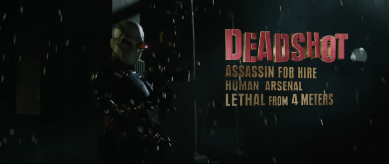
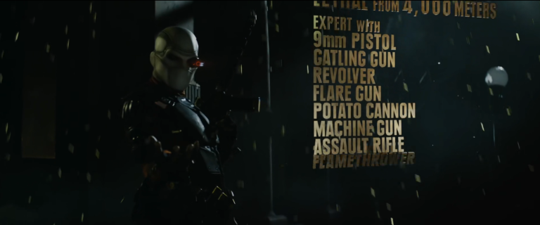
Typography
Typography is the art of text. Text is important, not only is it the main and only component of subtitles that allow the hard of hearing to enjoy film and television, but it is used to reinforce points and key words you might want to put emphasis on. If you are making an advert or even fancy titles you need to be using this technique to illustrate these points quickly.
My Examples
Kinetic Typography is the art of moving text. I have previously used this technique in several small projects;
The Nightmare Twins
Web Animation Presentation Credits
Kinetic Typography – For Digital Film Production
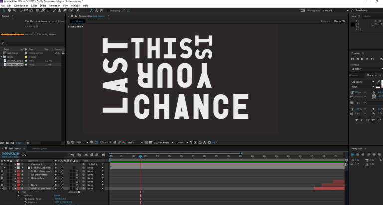
For my main example I have made this small piece using the Pill monologue from The Matrix. Using colour, text, and Adobe After Effects I have created Kinetic Typography to go over the audio.
References
Kinetic Typography: An Introductory Guide | Design Shack. 2017. Kinetic Typography: An Introductory Guide | Design Shack. [ONLINE] Available at: https://designshack.net/articles/typography/kinetic-typography-an-introductory-guide/. [Accessed 04 January 2017].
IMDb. 2017. Suicide Squad (2016) – IMDb. [ONLINE] Available at: http://www.imdb.com/title/tt1386697/. [Accessed 04 January 2017].
Some Of The Best Kinetic Typography Examples. 2017. Some Of The Best Kinetic Typography Examples. [ONLINE] Available at: http://www.designyourway.net/blog/inspiration/some-of-the-best-kinetic-typography-examples/. [Accessed 04 January 2017].
Vimeo. 2017. Ira Glass on Storytelling on Vimeo. [ONLINE] Available at: https://vimeo.com/24715531. [Accessed 04 January 2017].
Spenser Bailer. 2012. Kinetic Typography. [ONLINE] Available at: https://vimeo.com/24533473. [Accessed 1 January 2017].
